[ BRANDING ] 01 / 10
ViDARR Brand identity.
- DELIVERABLES
- Brand guidelines · Logo system and lockups · Color and typography · Capability statement and line card · Business cards · Tradeshow banner
- LIVE SITE
- vidarrinc.com ↗
[ 02 ] OVERVIEW
ViDARR builds modular unmanned systems, night vision and equipment protection for the programs that field them, from a veteran-owned shop with two divisions under one name. The brand had to read as serious hardware to procurement teams while still feeling like a maker with an edge.
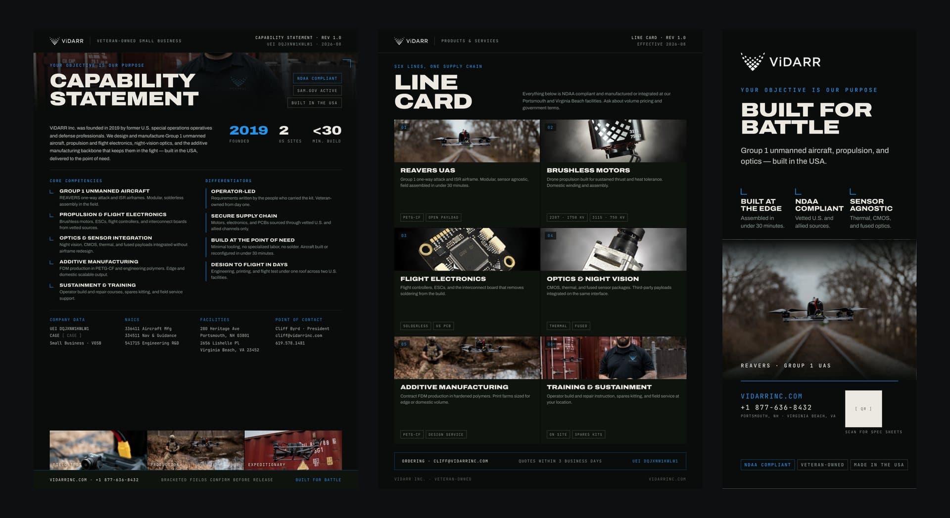
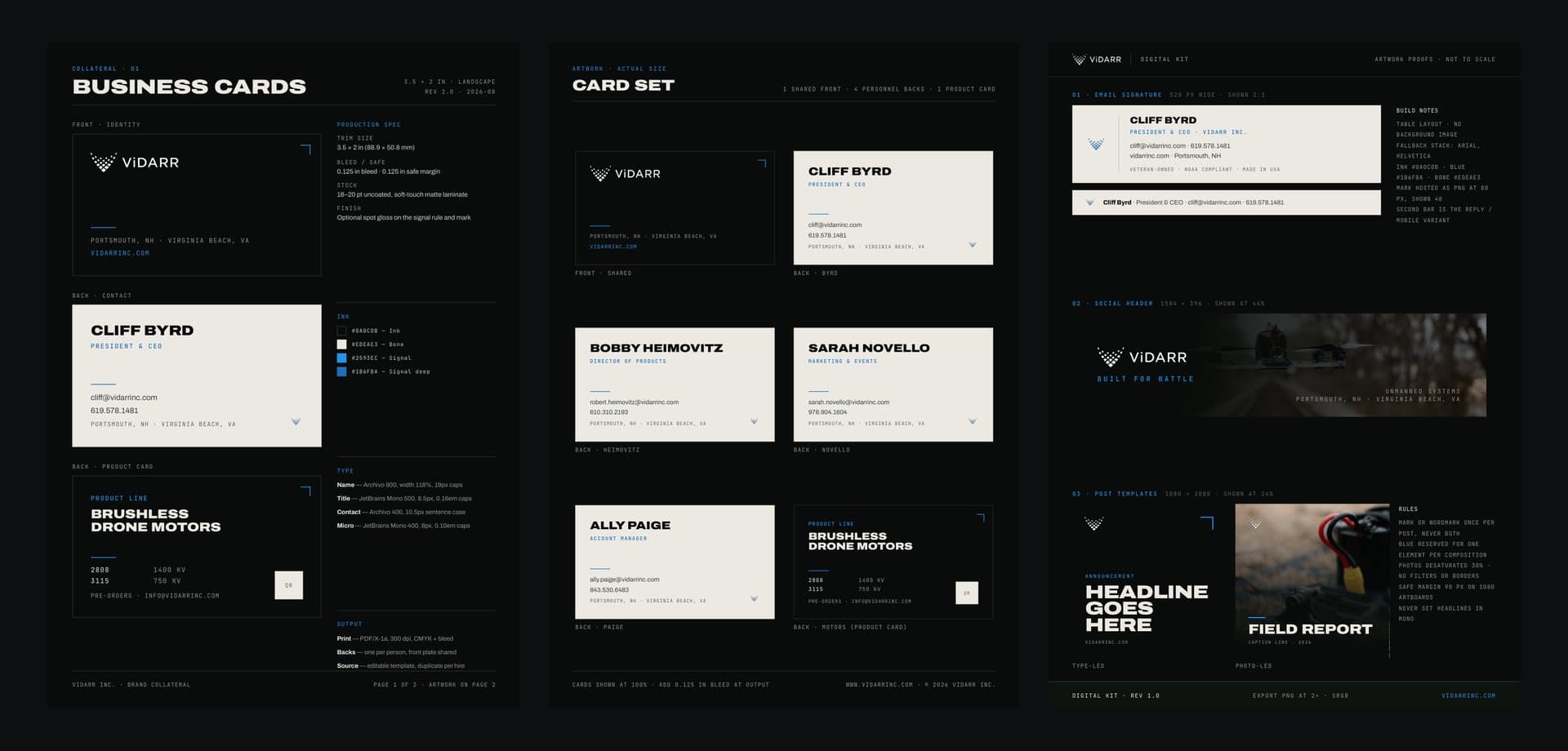
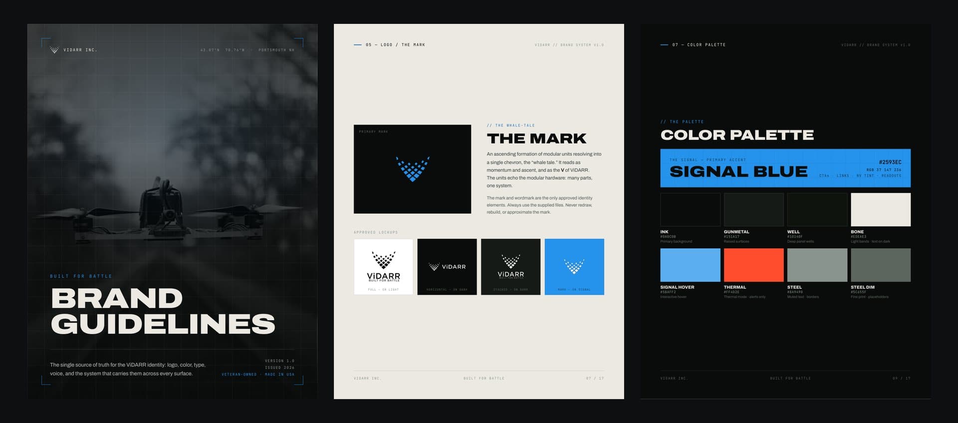
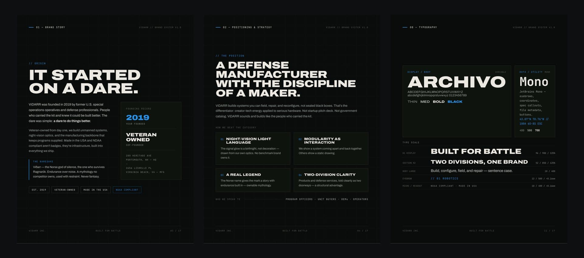
We built the system that carries it everywhere: brand guidelines covering the story, positioning, product divisions, the mark, color, type and tone of voice, then the collateral the sales team actually uses, from the capability statement and line card to business cards and a tradeshow banner.
[ 03 ] THE MARK AND THE PALETTE
The mark and the palette
The mark is an ascending formation of modular units resolving into a single chevron: it reads as momentum, as the V in ViDARR, and as the modular hardware itself, many parts working as one system. It ships in approved lockups for light, dark and Signal Blue backgrounds.
Signal Blue is the one accent, set against deep inks and gunmetals with a bone neutral for light bands, and a thermal orange kept for alerts only. Archivo carries the headlines and a monospace face handles the readouts, so every page looks like it came off the same spec sheet.
[ 04 ] COLLATERAL
Collateral
The same system runs through the capability statement, the line card for both divisions, letterhead, business cards for the team and a tradeshow banner, so ViDARR looks the same in a contracting officer's inbox as it does on the show floor.