[ BRANDING ] 04 / 10
The Wellness Drip Brand identity.
- DELIVERABLES
- Brand guide · Logo usage · Color palette · Typography · Photography direction · Web components
- LIVE SITE
- wellnessdripholyoke.com ↗
[ 02 ] OVERVIEW
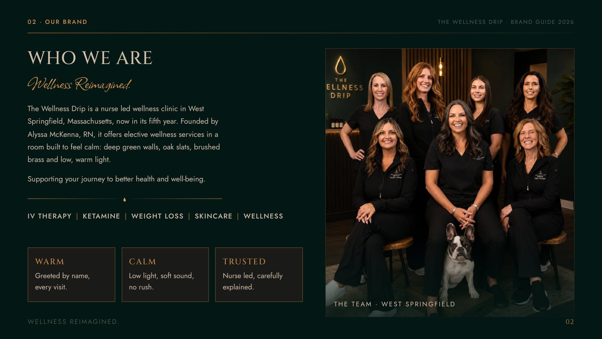
The Wellness Drip is a full-service wellness clinic in Holyoke, Massachusetts, offering IV therapy alongside its other treatments. As the clinic grew, it needed one brand that held together across the website, social, the front desk and every treatment page.
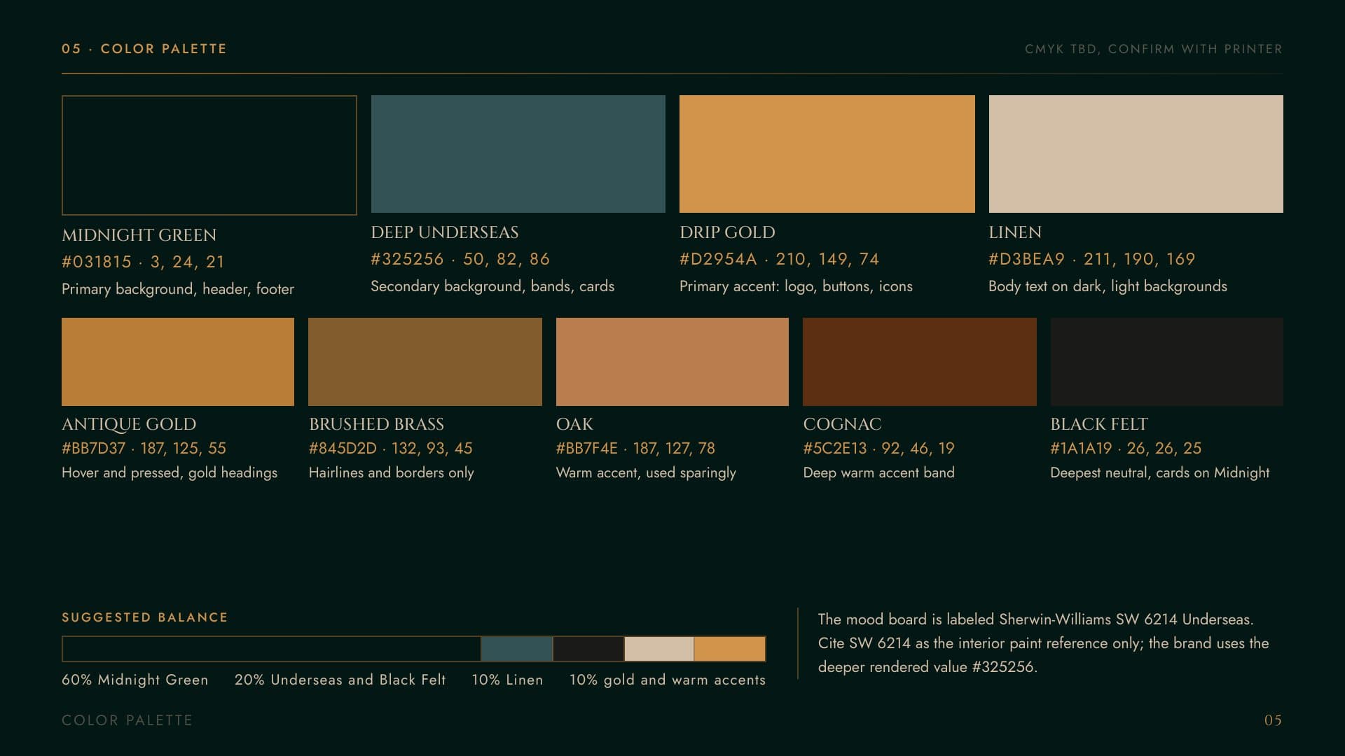
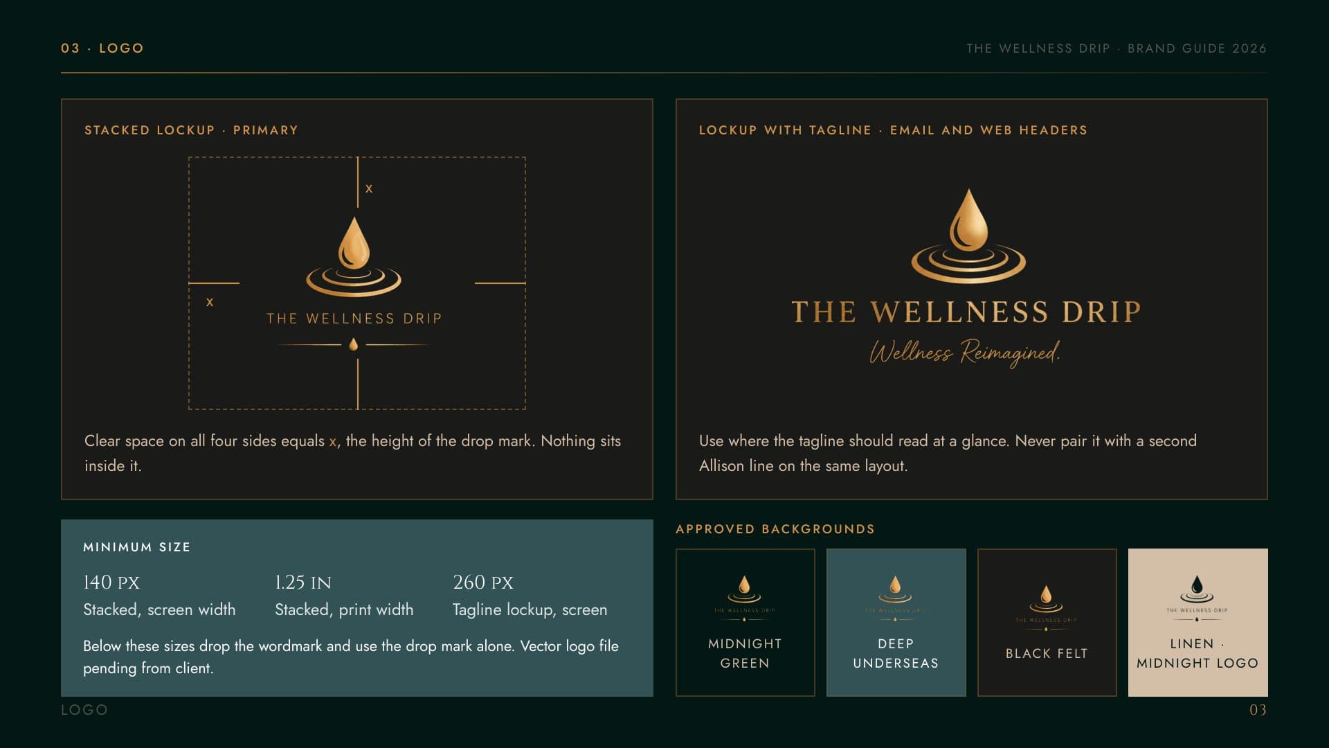
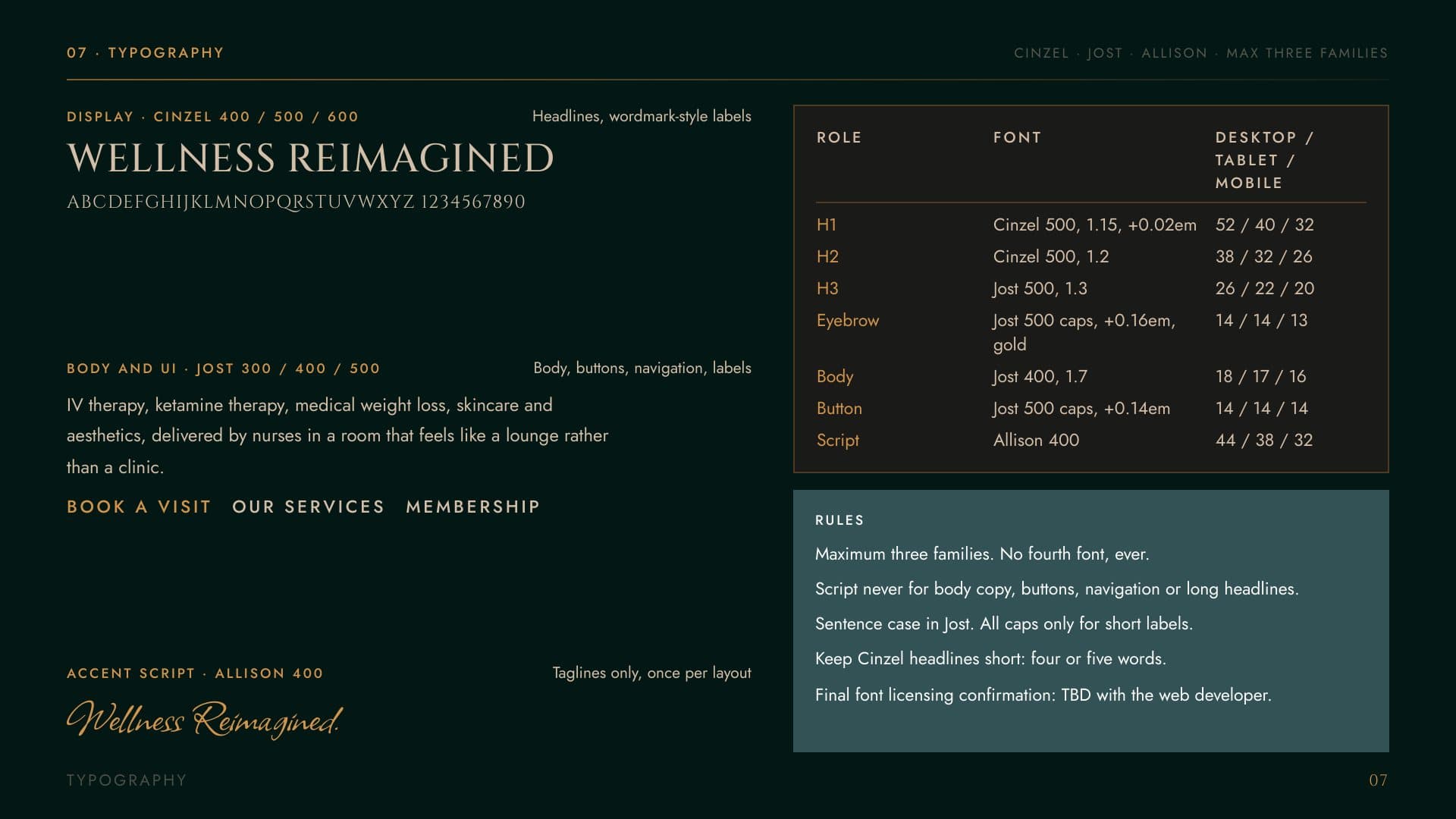
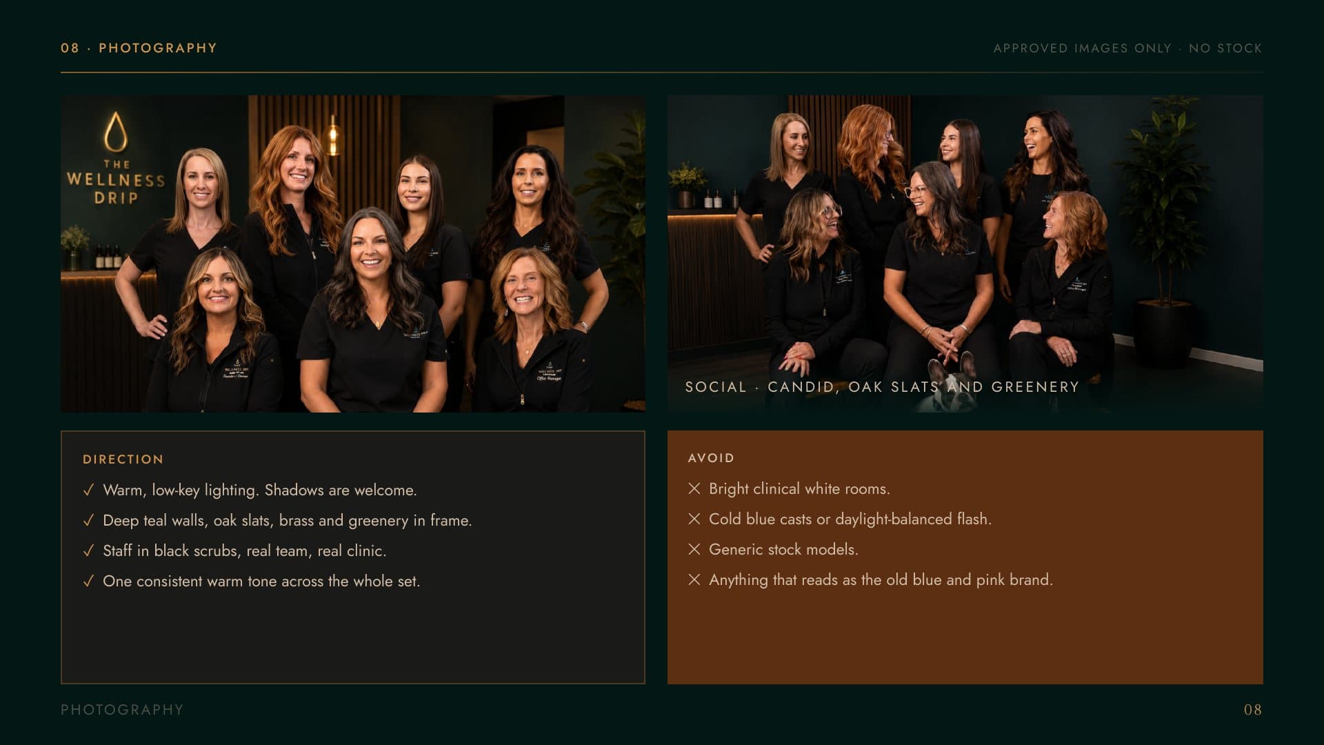
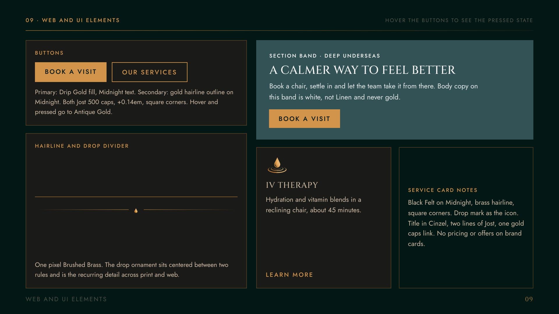
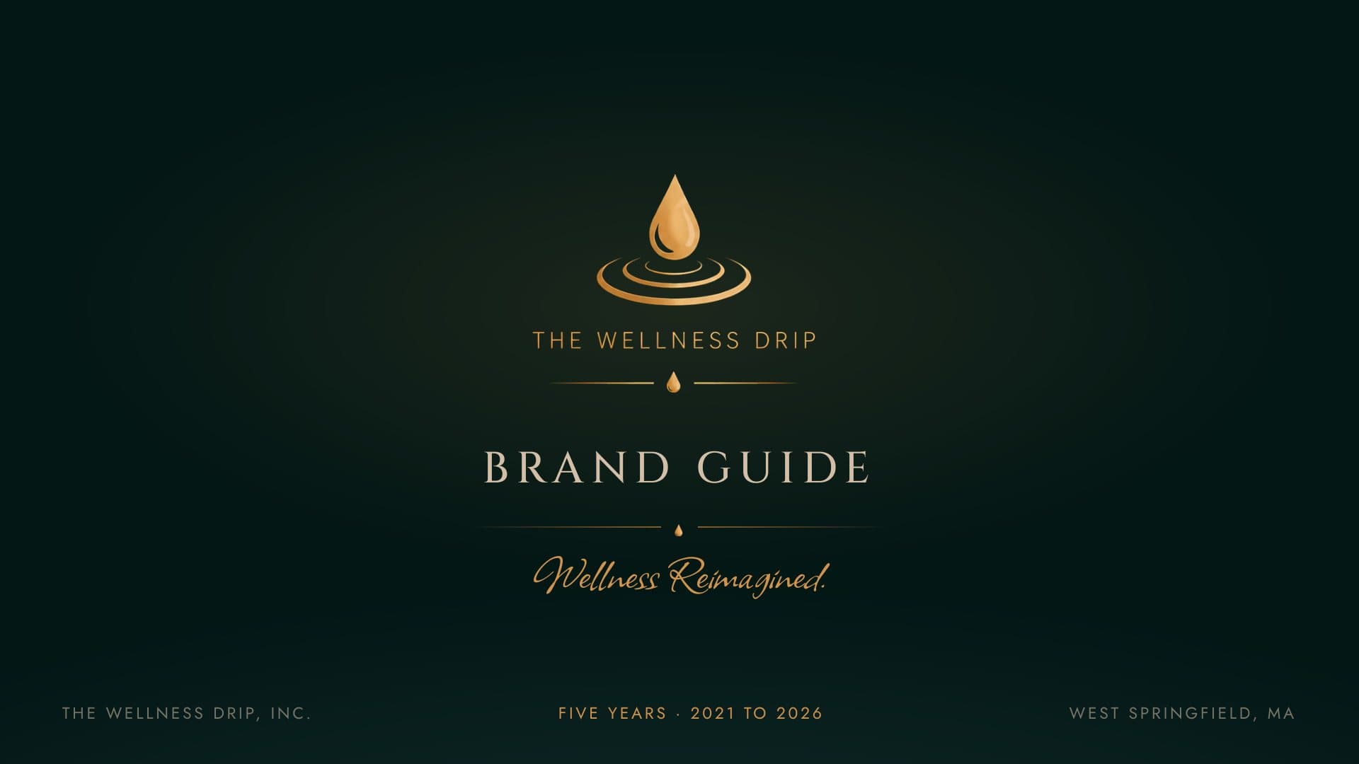
We built the brand guide that does that job: who they are, the logo and its rules, a deep green and gold palette, typography, photography direction for their team and space, and the web components the site is built from, all under one line: wellness, reimagined.
[ 03 ] ONE SYSTEM, EVERY TOUCHPOINT
One system, every touchpoint
The guide spells out the palette in its exact values, pairs a refined serif with a script accent for the tagline, sets the rules for the drop mark, and shows how buttons, cards and booking prompts should look, so new pages and posts come out on brand without a designer in the loop.