[ BRANDING ] 05 / 10
Architectural Metal Panels Brand identity.
- DELIVERABLES
- Primary logo and variations · Logo usage and clear space · Typography · Color palette · Brand imagery
- LIVE SITE
- archmetalpanels.com ↗
[ 02 ] OVERVIEW
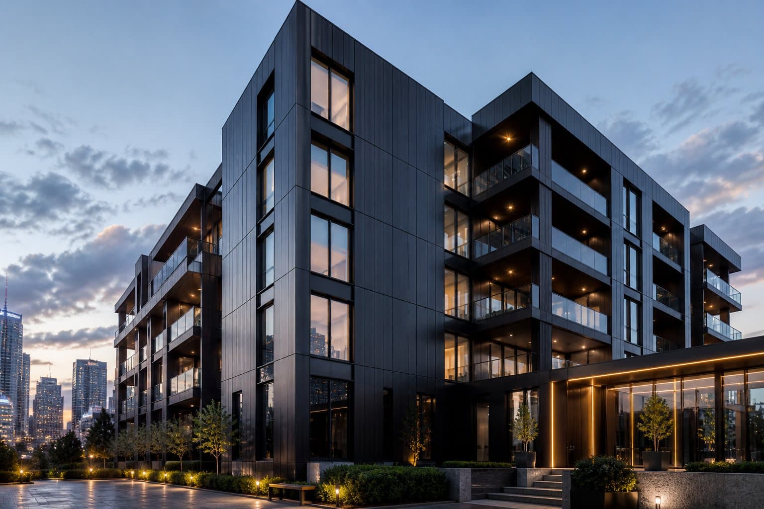
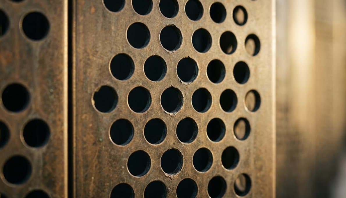
Architectural Metal Panels fabricates the metal that shapes modern buildings: facade cladding, perforated screens, sunshades and more. The brand needed to look as precise and engineered as the panels themselves.
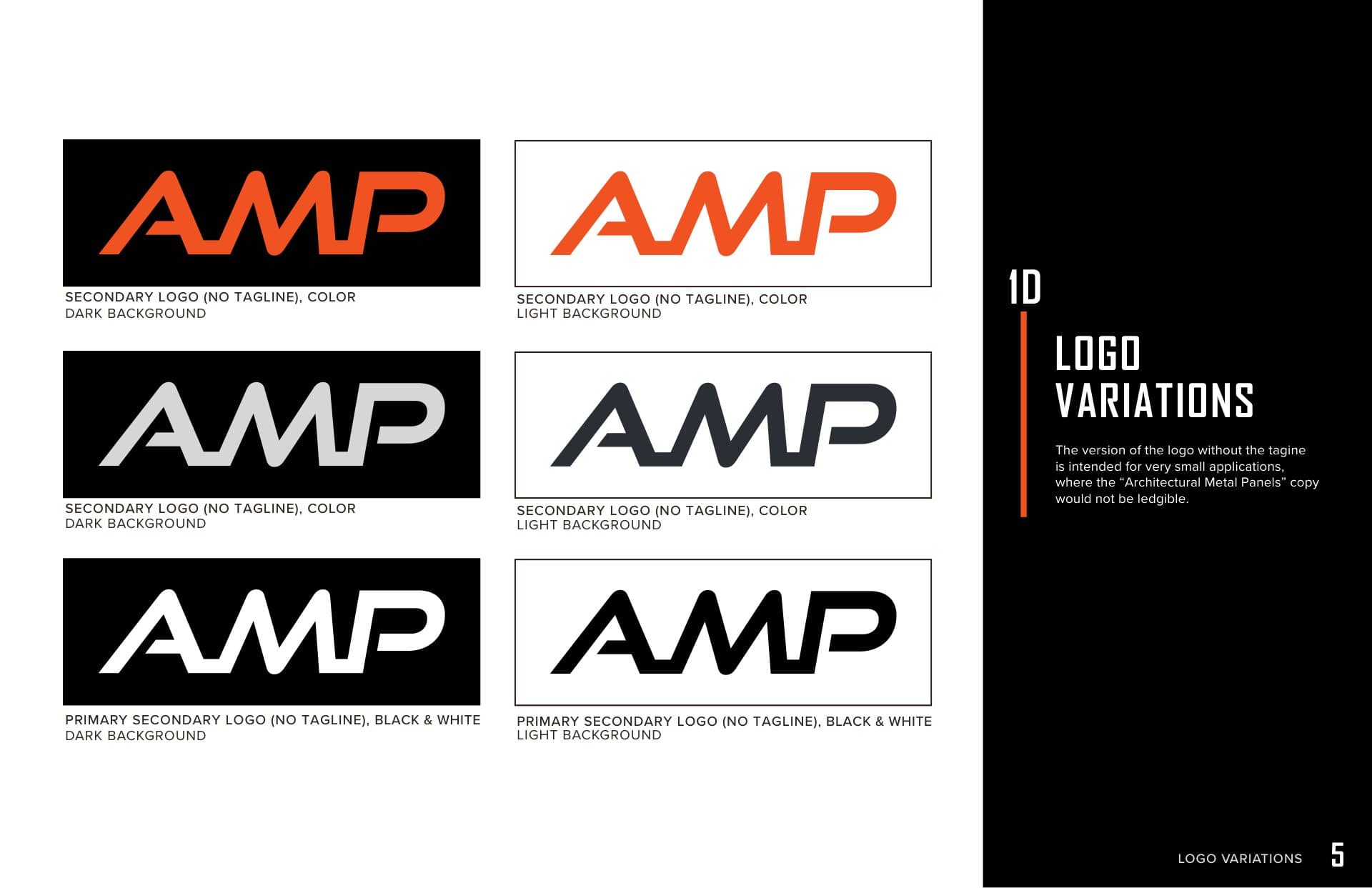
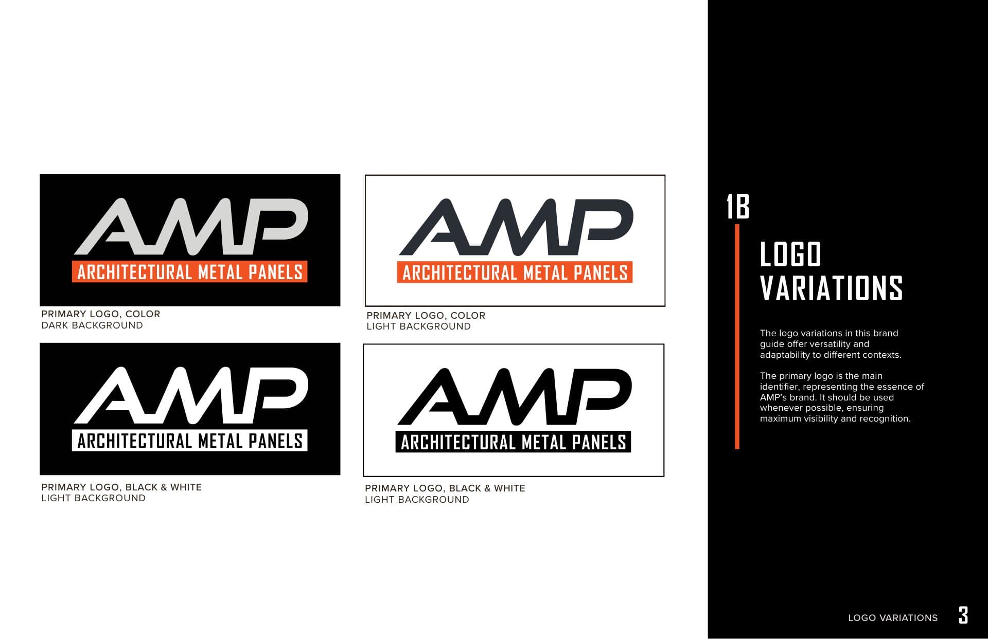
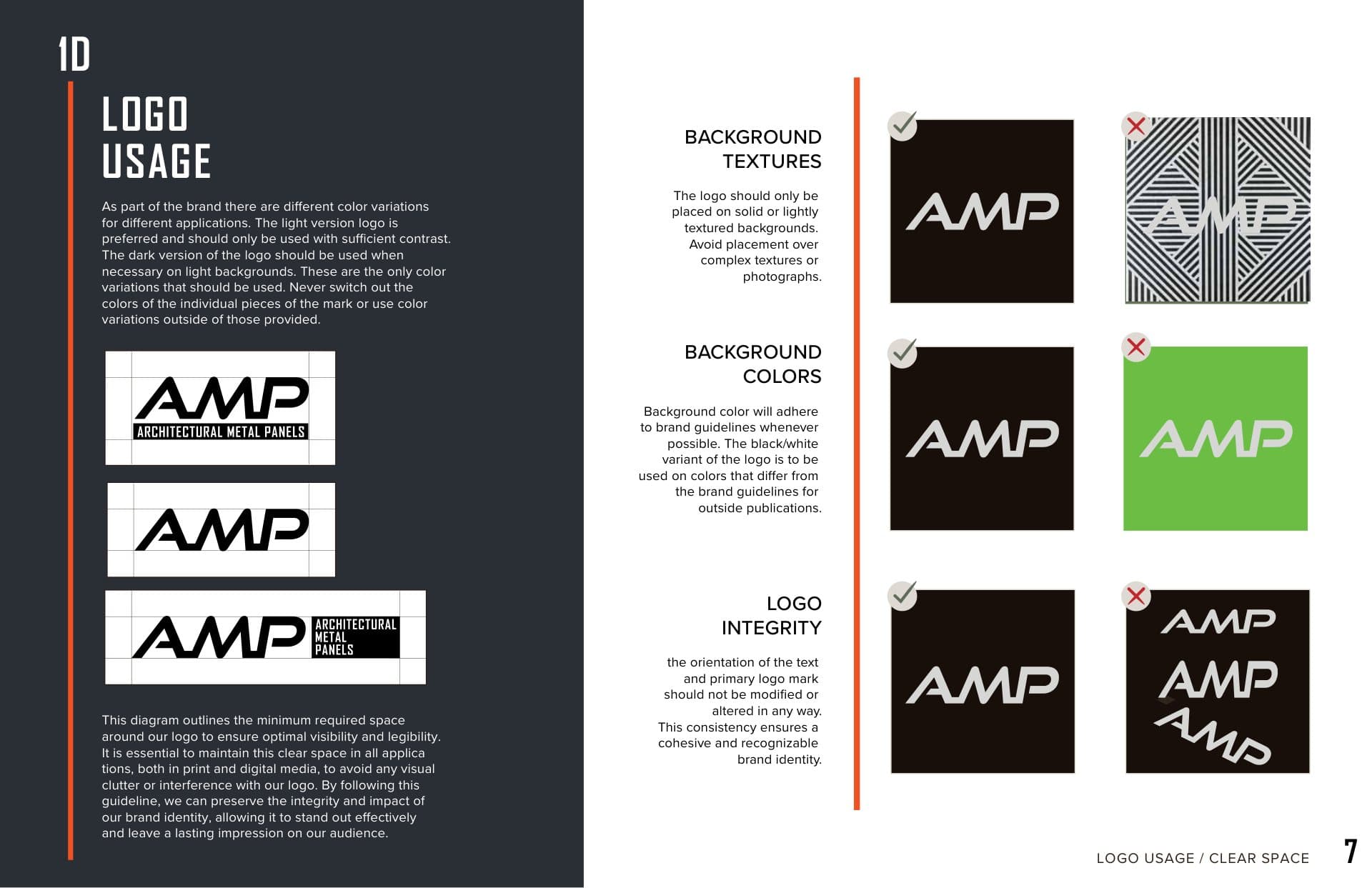
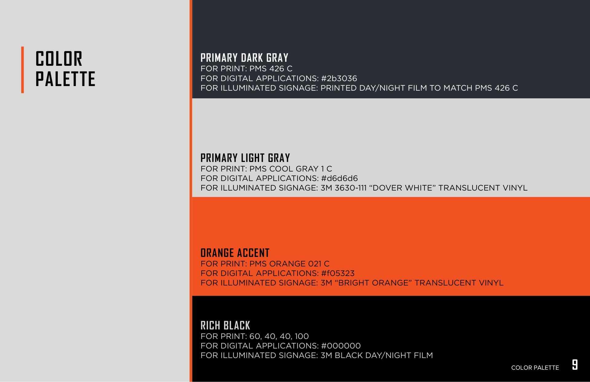
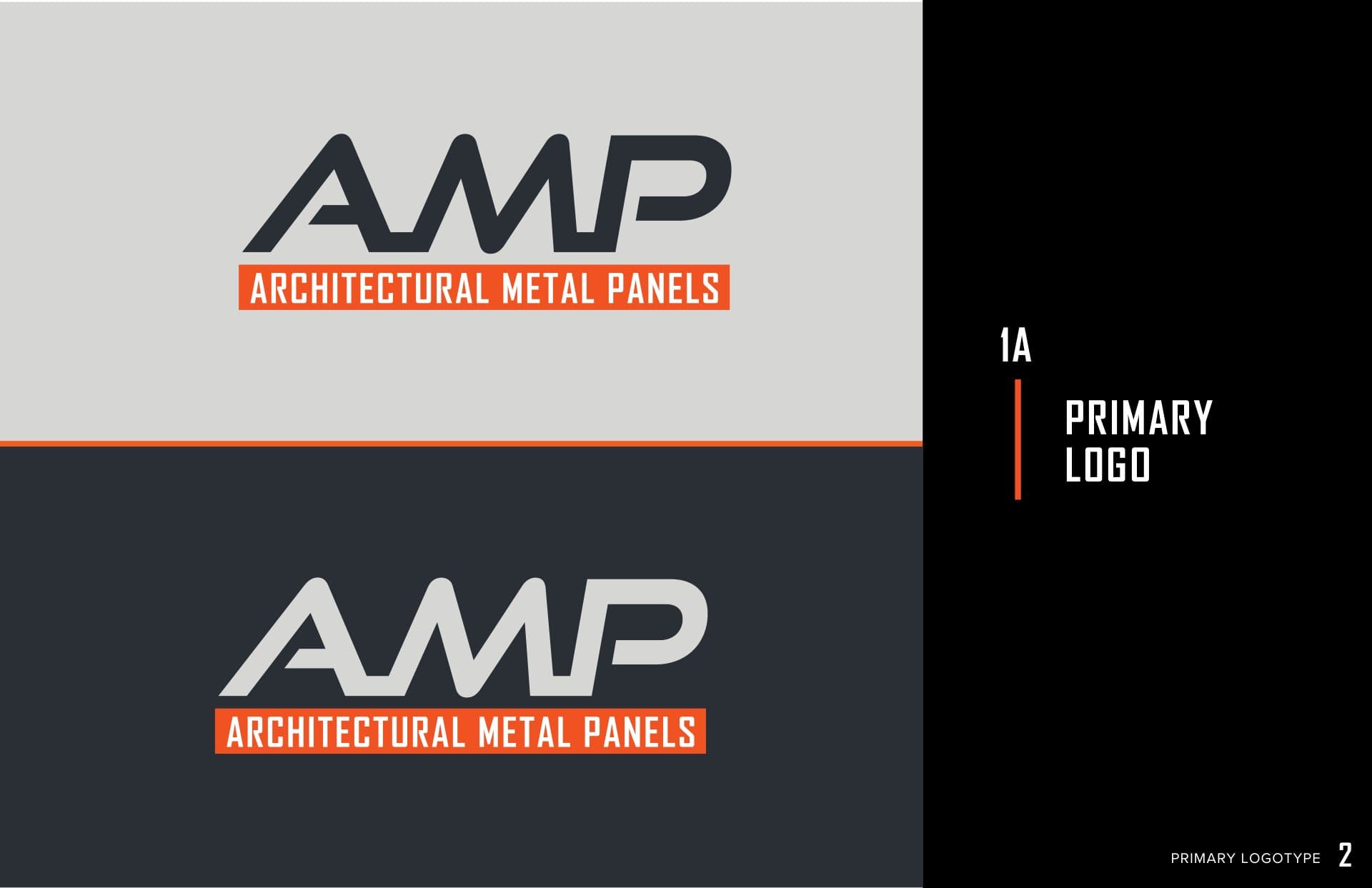
We developed the AMP brand guidelines: a primary logo with landscape and tailing variations, rules for usage, clear space and backgrounds, a typography system, and a color palette specified for print, digital and illuminated signage, plus the architectural imagery the website is built around.
[ 03 ] BUILT LIKE THE PRODUCT
Built like the product
The AMP wordmark is set in a wide, angled letterform with a bright orange bar carrying the full name, so it works at the size of a site sign and the size of a favicon. A palette of dark and light grays, rich black and a single safety-orange accent echoes steel, concrete and the shop floor, with each color matched for paint, vinyl and digital use.