[ BRANDING ] 03 / 10
Oasis Wellness & Recovery Brand identity.
- DELIVERABLES
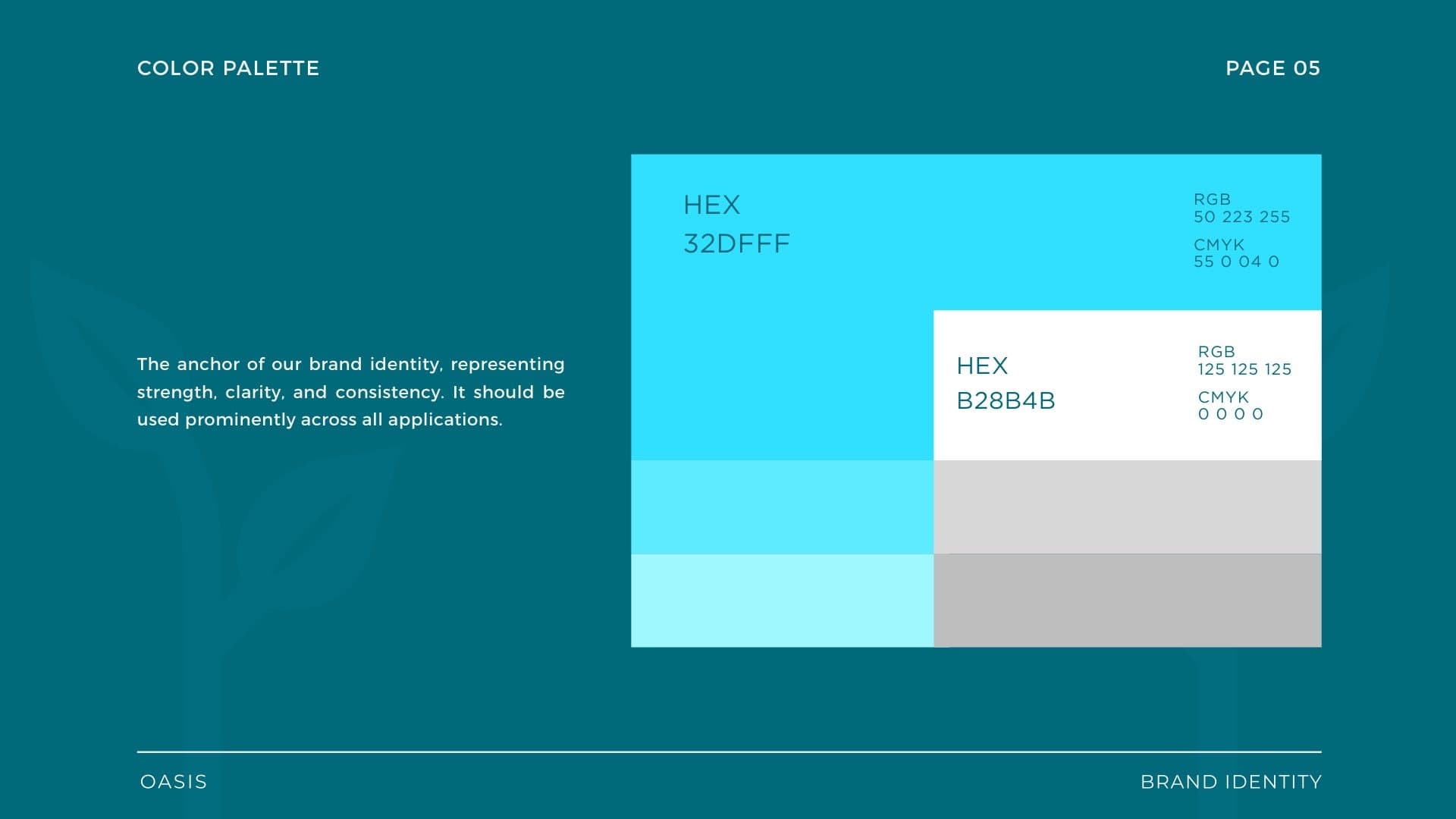
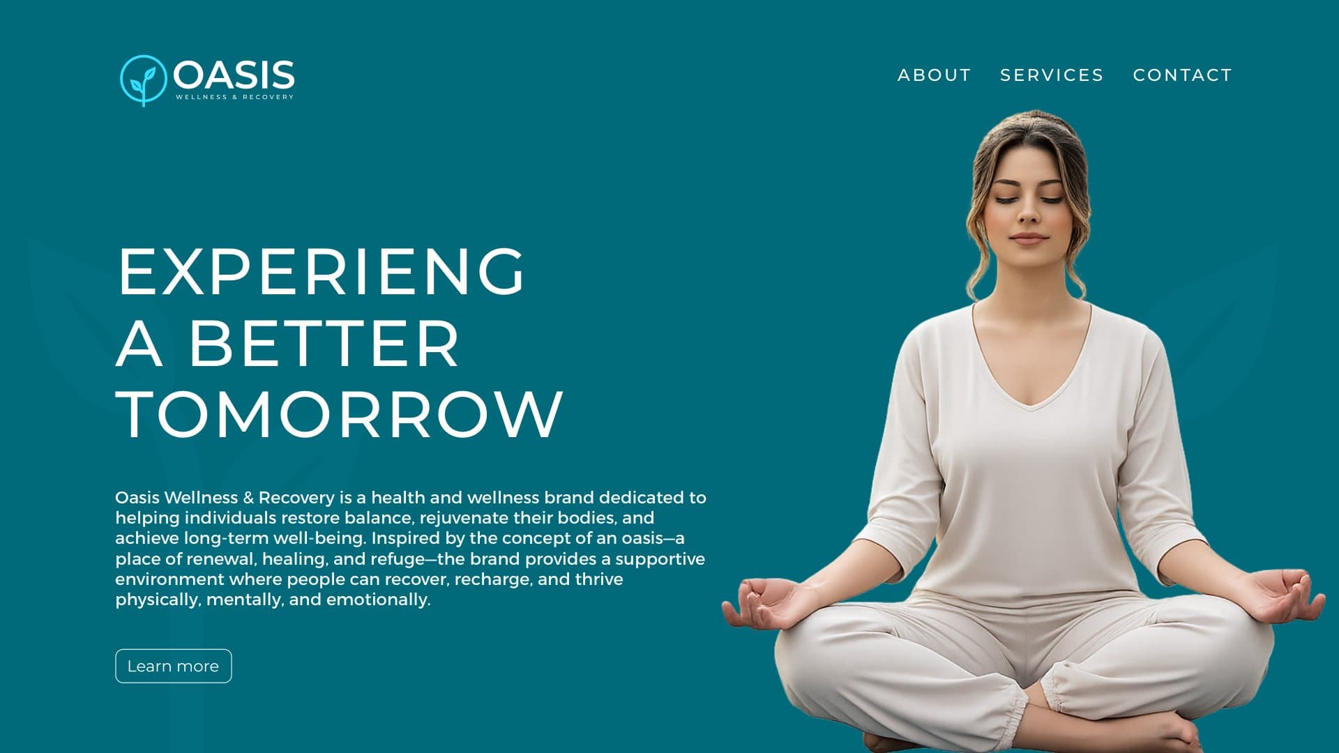
- Logo redesign · Brand guidelines · Color palette and typography · Logo do's and don'ts · Signage, stationery and web applications
- LIVE SITE
- oasiswr.com ↗
[ 02 ] OVERVIEW
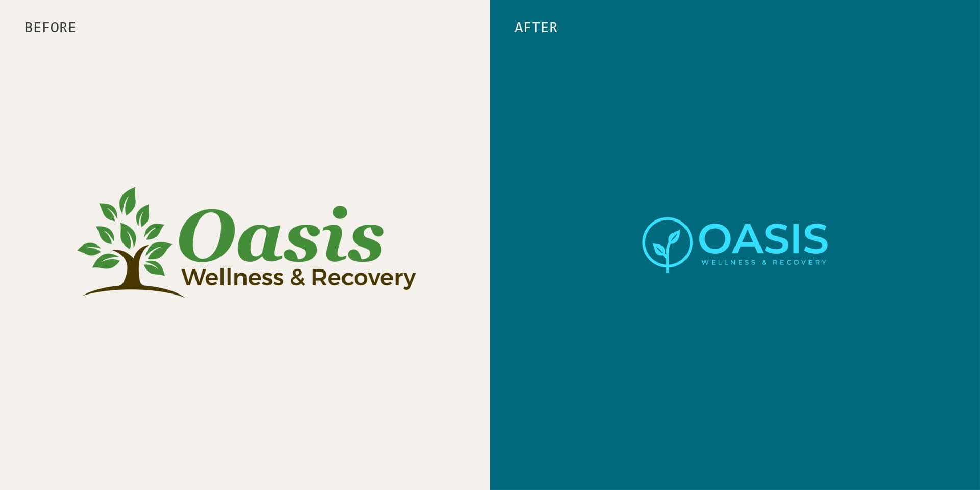
Oasis Wellness & Recovery helps people restore balance and rebuild their health through compassionate care and recovery programs. Their old logo, a leafy tree in green and brown, felt generic and dated next to the care they actually provide.
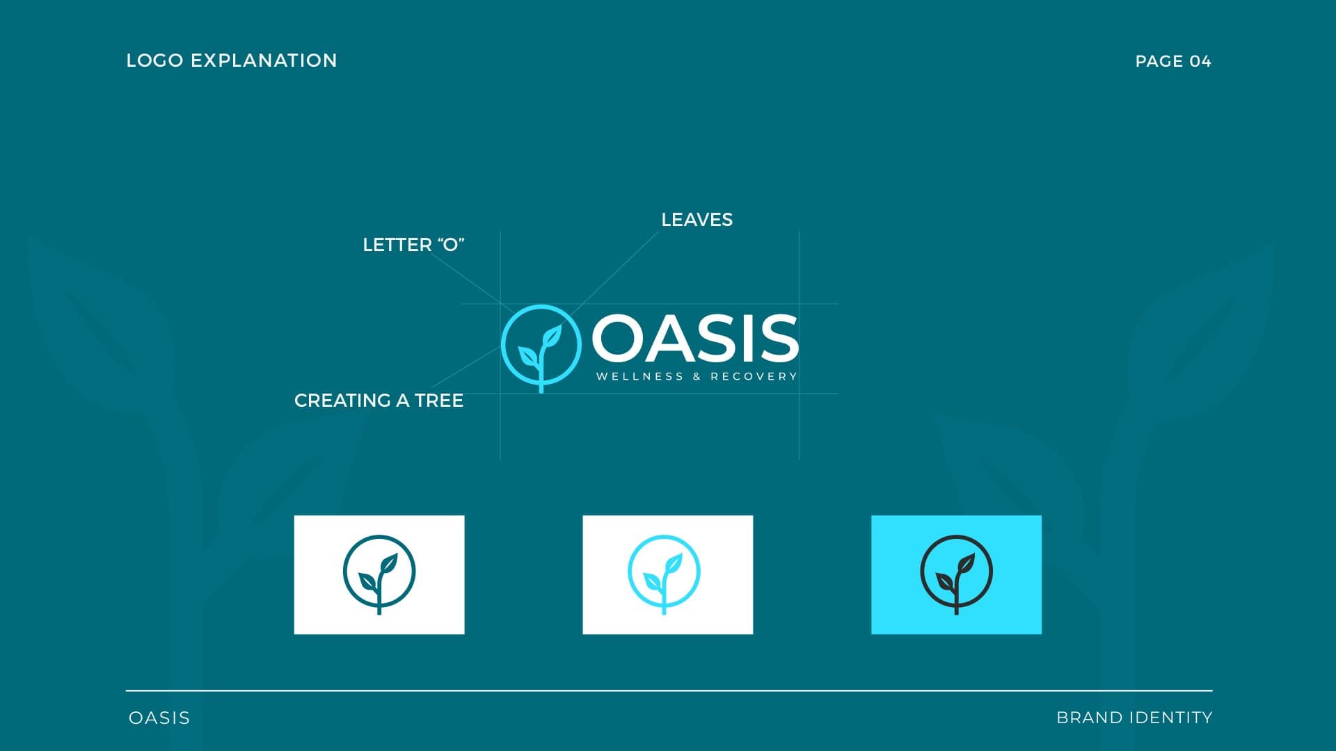
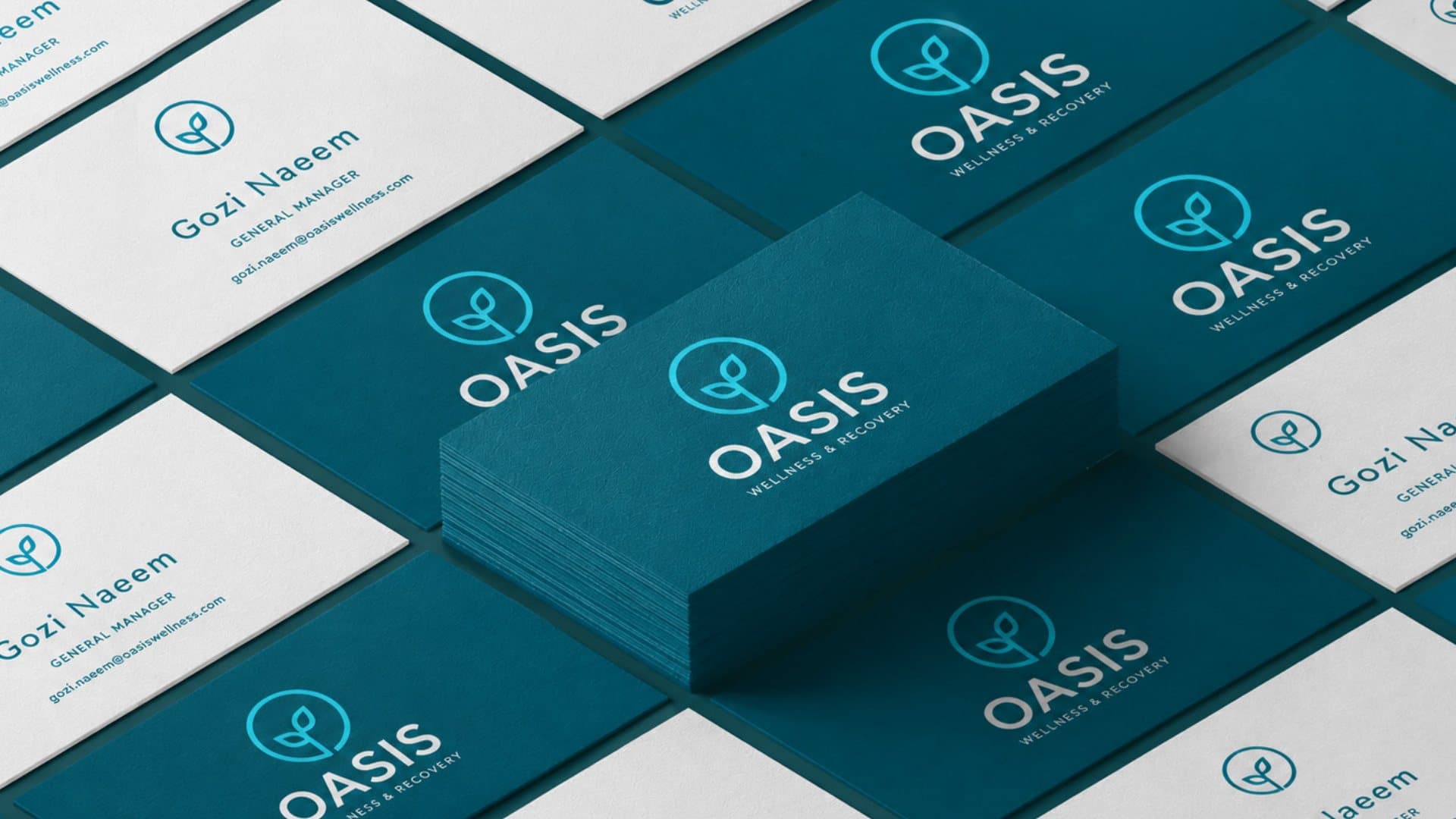
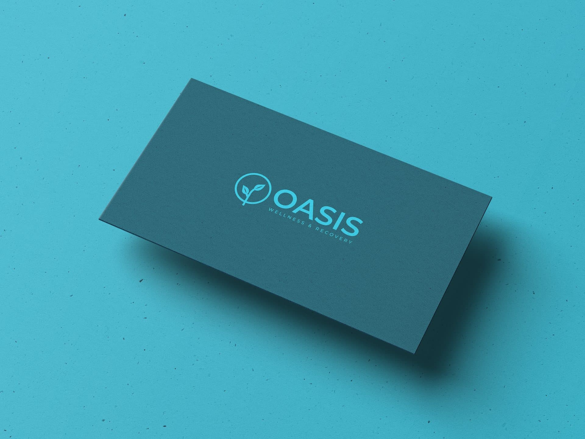
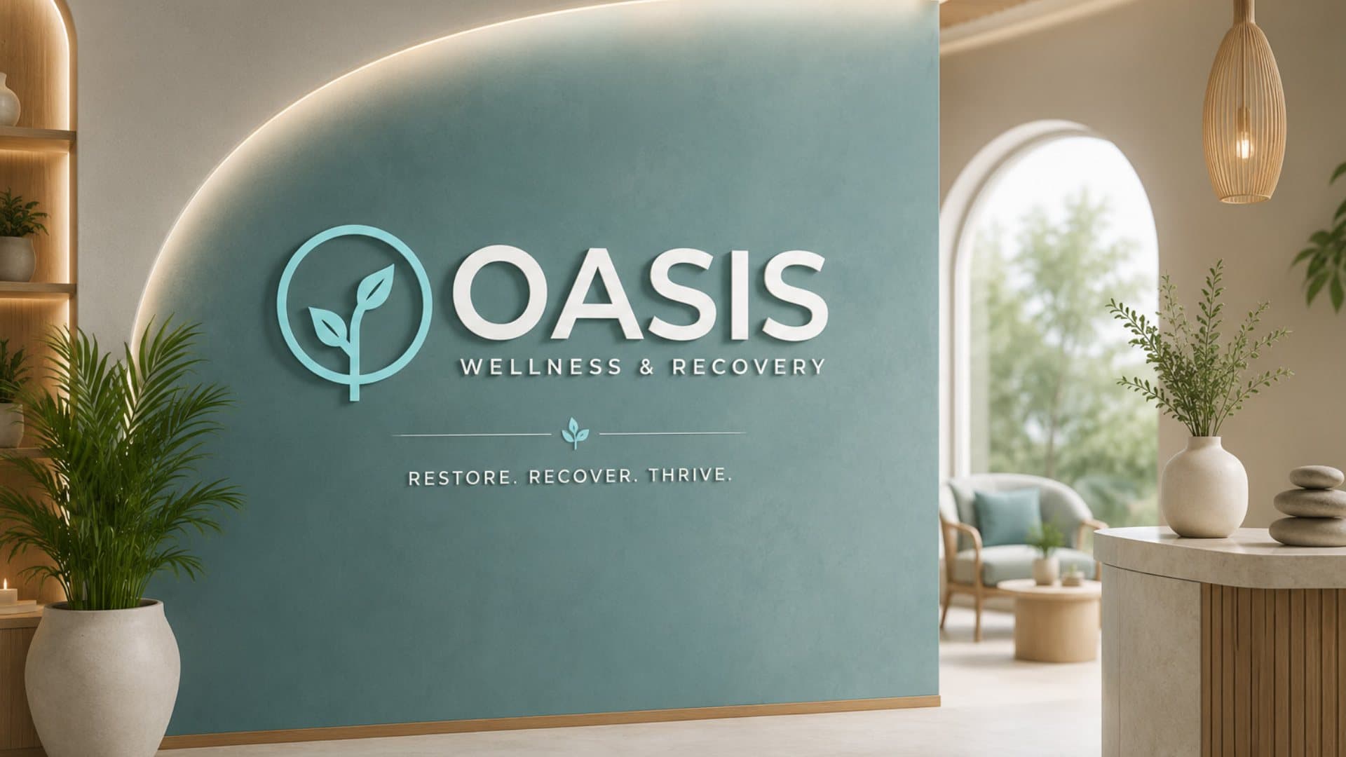
We rebuilt the identity around the name itself: a brand guide with the brand overview, a new logo and the thinking behind it, the color palette, typography, do's and don'ts, and the brand applied to the website, signage and business cards.
[ 03 ] BEFORE AND AFTER
Before and after
The new mark turns the O of Oasis into a ring with a young sprout growing through it, so the tree survives as an idea instead of an illustration. Deep teal and a bright aqua replace the old green and brown, and a clean Montserrat wordmark replaces the script, so the brand reads as modern and clinical without losing its warmth.