[ BRANDING ] 07 / 10
IsoPure Research Brand identity.

- DELIVERABLES
- Logo and brand mark · Brand presentation · Color palette · Typography · Iconography and patterns · Logo applications
- LIVE SITE
- isopureresearch.com ↗
[ 02 ] OVERVIEW
IsoPure Research develops and distributes high-purity research compounds, and its customers judge it on precision and consistency. The brand had to signal laboratory rigor at a glance.
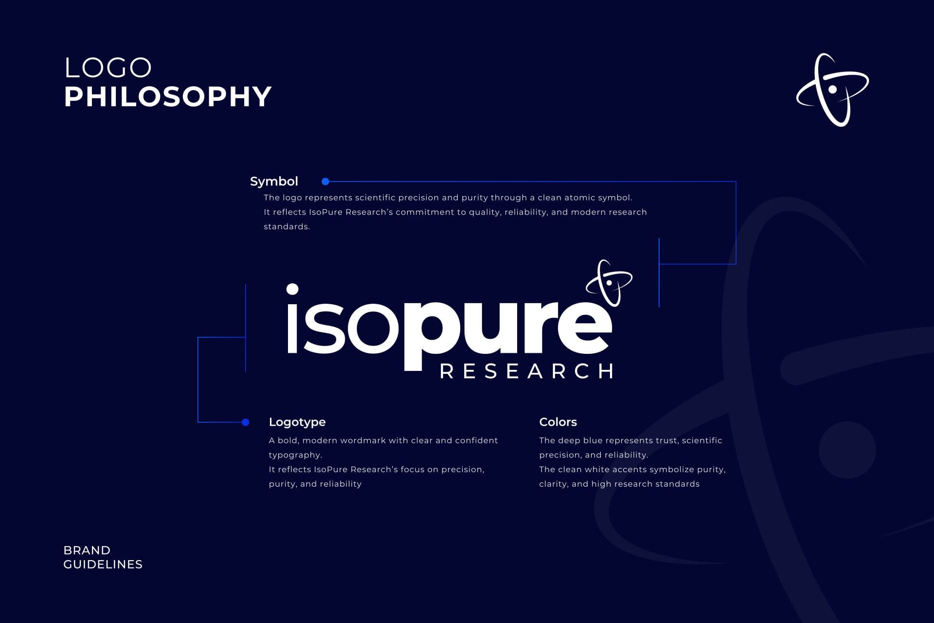
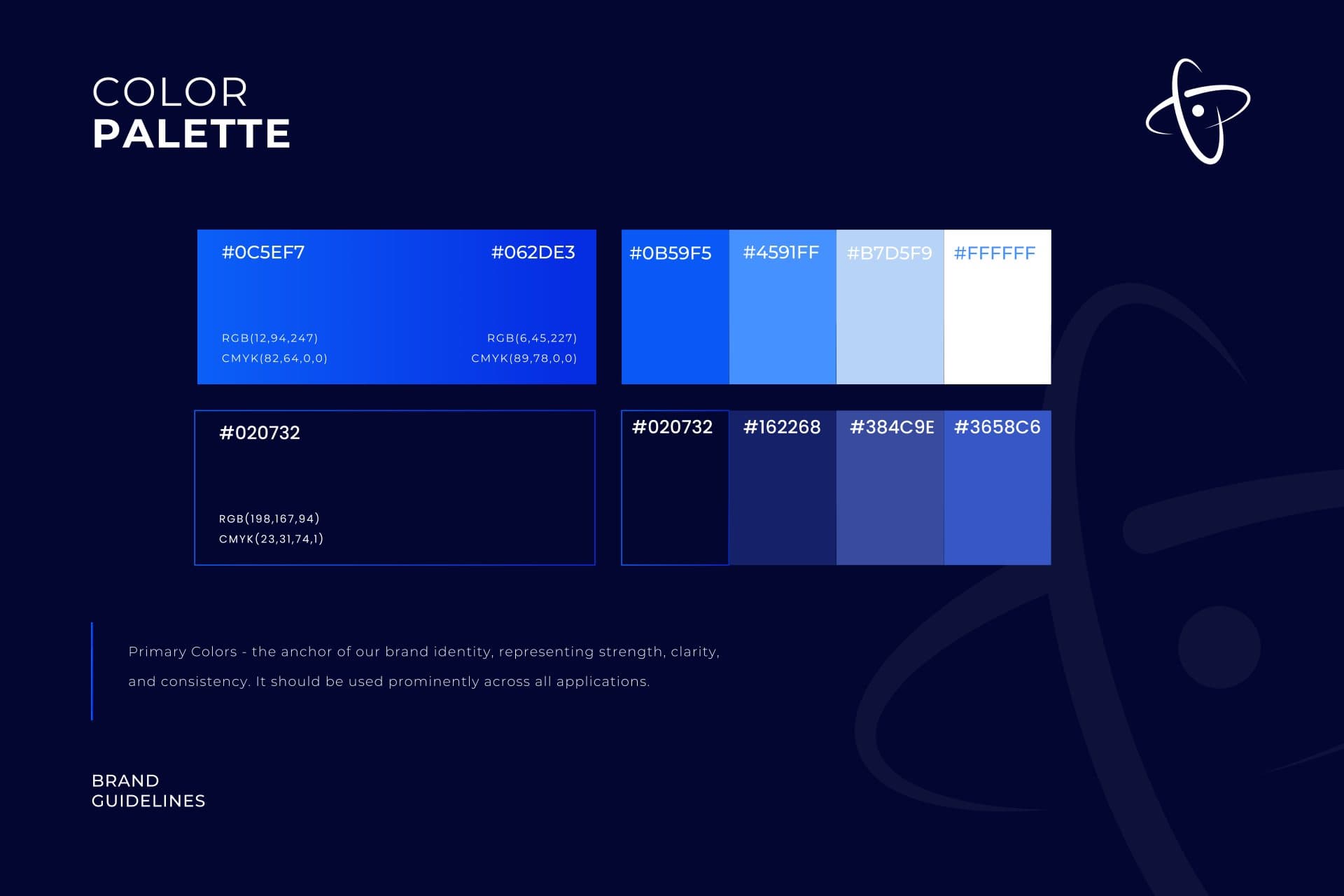
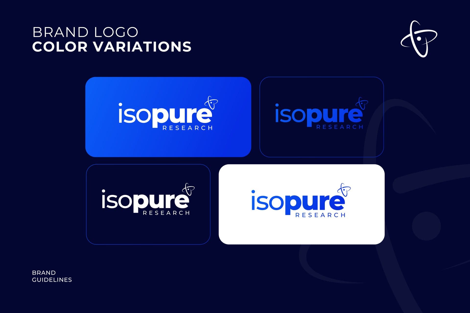
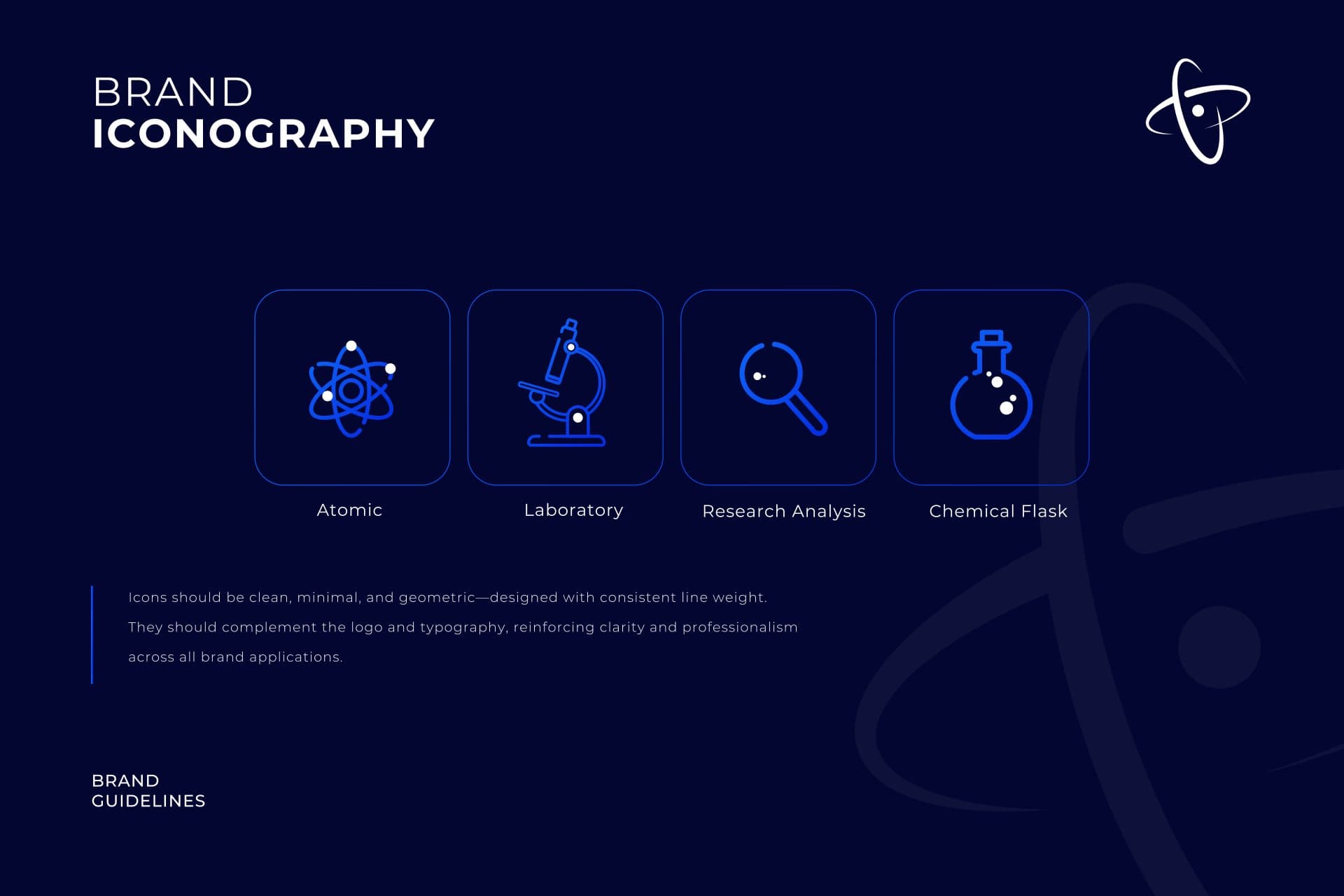
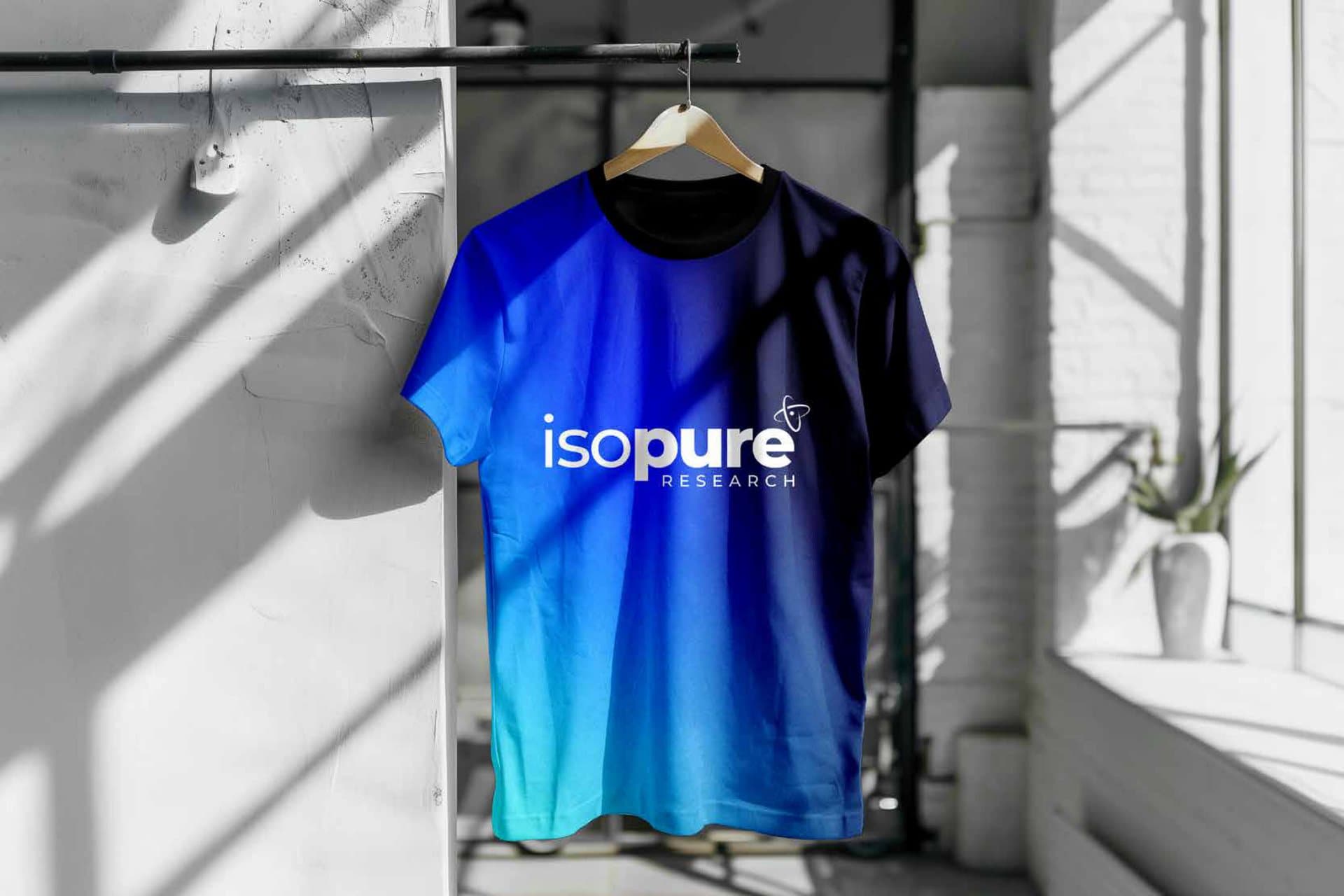
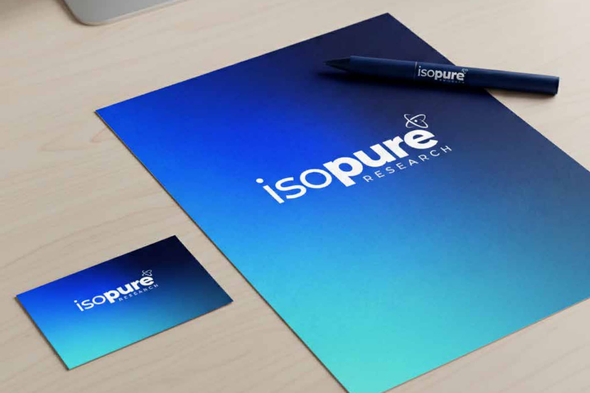
We built a complete brand presentation: the logo and the philosophy behind its orbit mark, primary and secondary versions, a deep navy to bright blue palette, Montserrat typography, iconography, patterns, do's and don'ts, and the logo applied to apparel, signage and stationery.
[ 03 ] THE MARK
The mark
A lowercase isopure wordmark sits beside an orbit symbol drawn from atomic structure, with the brand mark able to stand alone on its own. Electric blue gradients over deep navy give the brand its energy, and every color is specified for print and screen.